

[Image Prompt: A bright, airy kitchen with open shelves styled for spring using light ceramics, simple greenery, stacked bowls, and natural wood accents, photographed in soft daylight with a high-end camera, neutral tones, shallow depth of field, no text or words in the image.]
Open shelves can feel calm and pulled together when styled with intention. Spring is a great time to reset shelves that may feel heavy or cluttered after winter. With lighter colors, simple layers, and thoughtful spacing, open shelving can look relaxed and lived-in without appearing busy. These ideas focus on balance, budget-friendly styling, and small swaps that make a visible difference without overdoing it.
1. Soft White Dish Stacks With Breathing Room
[Image Prompt: A spring-styled open shelf with neatly stacked white ceramic plates and bowls, spaced evenly with light shadows, natural wood shelving, soft daylight, high-end camera photography, no text.]
Stacking white dishes keeps shelves calm and easy on the eyes. Use only what you reach for weekly. That alone reduces clutter. Leave small gaps between stacks so each group stands on its own. This spacing keeps shelves from feeling crowded.
If you do not own matching sets, mix similar shapes instead. Thrift stores are helpful for finding neutral plates cheaply. Small chips add character and do not show from a distance.
Place taller stacks toward the ends. Shorter stacks work well in the middle. This creates a gentle visual rhythm without calling attention to itself.
Avoid filling every inch. Empty space matters here. It helps the shelf feel lighter and more settled.
2. Clear Glass Jars With Simple Contents
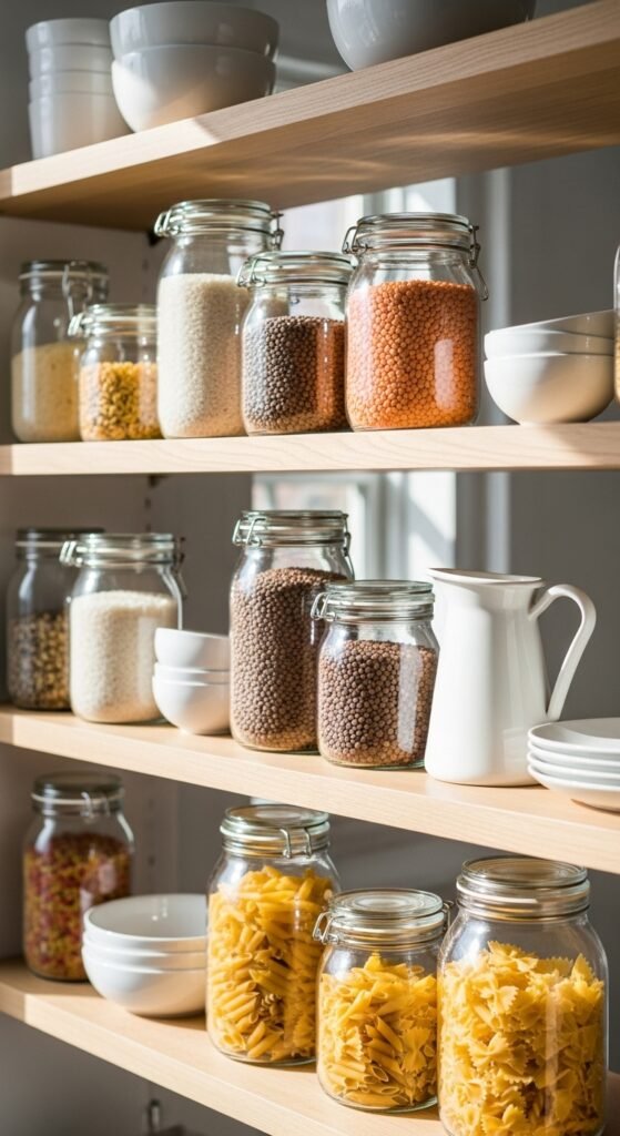
Clear jars add light without visual weight. Fill them with pantry items you already use. Keep contents neutral in tone for a calmer look.
Use jars of similar height to avoid visual noise. Matching lids help but are not required. Even mismatched jars feel cohesive when contents stay simple.
Limit jars to three or five per shelf. Odd numbers read more naturally. Too many jars feel busy.
If labels are printed on jars, remove them. Clean glass looks softer and more intentional.
This approach works well in kitchens and dining spaces. It brings order without feeling styled for show.
3. Small Greenery in Neutral Pots
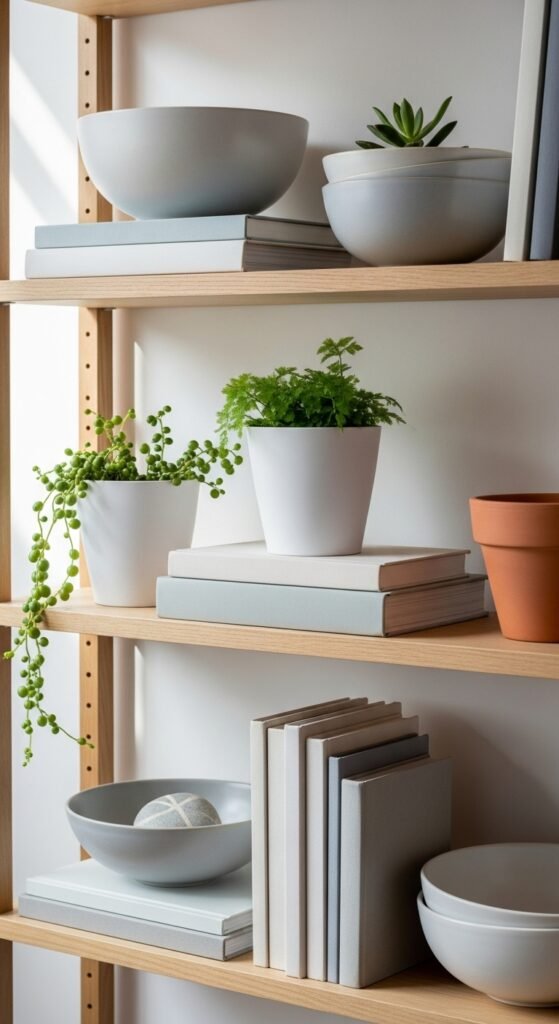
Greenery brings life without clutter when used sparingly. Choose small plants with simple shapes. Avoid trailing styles that hang too far forward.
Neutral pots help greenery feel grounded. White, clay, or light stone tones work well. If pots are colorful, keep the plant count lower.
Group plants near sturdy items like bowls or books. This keeps shelves from feeling top-heavy.
If real plants feel like work, faux versions still look good when leaves are simple and not glossy.
One or two plants per shelf is enough. Balance comes from restraint.
4. Cookbooks Turned Sideways
[Image Prompt: Open shelving with cookbooks stacked horizontally, paired with ceramic bowls and small decor objects, natural spring light, high-end camera, no text.]
Turning books sideways lowers their visual height. This helps shelves feel calmer and less rigid.
Choose books with neutral spines. Remove dust jackets if colors feel loud. Plain covers often work better.
Stack two or three books at most. Place a small bowl or object on top for structure.
This works well between taller items. It breaks up vertical lines without adding clutter.
Library sales and secondhand shops are great for affordable books used mainly for display.
5. Mixing Wood Tones Gently
[Image Prompt: Spring open shelves styled with light and medium wood accents, white ceramics, and glassware, soft daylight, high-end camera photography.]
Mixing wood tones adds warmth without heaviness when done gently. Stick to two tones per shelf.
Keep shapes simple. Cutting boards, small trays, or wooden bowls work well.
Avoid lining up too many wood items together. Break them up with white or glass pieces.
If shelves already have strong wood grain, choose lighter accessories so nothing competes.
This approach keeps shelves grounded while still feeling light for spring.
6. Everyday Mugs in Soft Colors
[Image Prompt: Open shelf with everyday mugs in soft neutral tones like cream, beige, and pale gray, styled neatly with spacing, spring daylight, high-end camera.]
Display only the mugs you actually use. This keeps shelves practical and tidy.
Choose similar shapes even if colors differ slightly. Shape consistency matters more than color.
Hang handles in the same direction for visual order. This small detail makes shelves feel calm.
If mugs feel bulky, limit to one row. Store extras elsewhere.
Secondhand shops often have great neutral mugs at low prices.
7. One Statement Bowl Per Shelf
[Image Prompt: A single ceramic statement bowl placed on an open shelf with white dishes and light wood accents, spring lighting, high-end camera.]
A single larger bowl adds interest without clutter. Choose one with a simple profile.
Keep colors muted so the bowl supports the shelf rather than stealing attention.
Place it slightly off-center. This keeps the shelf from feeling stiff.
Avoid adding small items around it. Let the bowl stand on its own.
This works well on middle shelves where the eye naturally rests.
8. Layered Frames Without Artwork Overload
[Image Prompt: Open shelves styled with a few simple photo frames layered behind decor objects, neutral tones, spring light, high-end camera.]
Use frames with white mats or light wood finishes. Leave them empty or use simple prints.
Lean frames instead of hanging them. This feels relaxed and easy.
Limit frames to one or two per shelf. More than that feels busy.
Layer frames behind sturdier objects like bowls or jars.
This adds depth without visual noise.
9. Seasonal Textures Through Linen
[Image Prompt: Open shelf styled with folded neutral linen cloths and simple ceramics, bright spring light, high-end camera photography.]
Folded linen adds softness without clutter. Choose light tones like cream or sand.
Stack two or three cloths only. Keep folds neat but not stiff.
This works well in kitchens and dining spaces.
Linen napkins are affordable and easy to rotate seasonally.
Avoid patterned fabrics here. Simple texture does the work.
10. Grouping Items in Threes
[Image Prompt: Open shelf decor arranged in groups of three items, including ceramics, glass, and greenery, spring daylight, high-end camera.]
Groups of three feel natural and balanced. Use varied heights within each group.
Keep colors within the same family. This helps items read as one unit.
Avoid spreading groups too evenly. Let some areas breathe.
This method helps guide the eye gently across the shelf.
11. Light Ceramics With Matte Finishes
[Image Prompt: Open shelves featuring matte ceramic vases and bowls in soft neutral shades, spring lighting, high-end camera photography.]
Matte ceramics absorb light softly. This keeps shelves calm.
Use simple shapes. Avoid heavy texture or bold patterns.
Limit decorative ceramics to a few pieces per shelf.
Thrift stores often carry plain ceramics that work well.
This approach pairs nicely with wood and glass.
12. Staggered Heights for Visual Flow
[Image Prompt: Open shelves styled with decor at varied heights, including tall vases and low bowls, spring light, high-end camera.]
Avoid lining items up at the same height. This creates a flat look.
Mix tall, medium, and low pieces gently.
Keep height changes subtle rather than dramatic.
This creates movement without chaos.
13. Neutral Baskets for Soft Storage
[Image Prompt: Open shelves styled with small woven baskets holding household items, neutral tones, spring daylight, high-end camera.]
Small baskets hide everyday items while adding texture.
Stick to one basket style for consistency.
Use baskets on lower shelves for weight balance.
This keeps shelves useful without visual mess.
14. Open Space as a Design Choice
[Image Prompt: Open shelves with intentional empty space between decor groupings, light spring atmosphere, high-end camera.]
Leaving shelves partially empty is a design choice, not a mistake.
Empty space gives the eye a place to rest.
Resist filling gaps just because they exist.
This keeps shelves calm and flexible.
15. Pale Stone Accessories
[Image Prompt: Open shelf styled with pale stone objects like small bowls and trays, neutral tones, spring lighting, high-end camera.]
Stone adds weight without darkness when colors stay light.
Use one or two stone items only.
Place them near wood for contrast.
This keeps shelves grounded and steady.
16. Simple Vases Without Flowers
[Image Prompt: Open shelves featuring empty ceramic vases with clean shapes, spring daylight, high-end camera photography.]
Empty vases still add shape and structure.
Choose simple profiles and light tones.
Group vases with sturdier items.
This avoids visual clutter.
17. Repeating One Color Gently
[Image Prompt: Open shelves styled with repeating touches of soft green across ceramics and decor, spring light, high-end camera.]
Repeating a single color ties shelves together.
Keep the color muted.
Use it once per shelf.
This creates quiet cohesion.
18. Books as Quiet Anchors
[Image Prompt: Open shelf decor using neutral-toned books as anchors beneath ceramics, spring lighting, high-end camera.]
Books ground lighter items.
Choose calm covers.
Stack horizontally.
This adds structure without noise.
19. Mixing Old and New Pieces
[Image Prompt: Open shelves styled with a mix of vintage and modern decor items, neutral tones, spring daylight, high-end camera.]
Older pieces add warmth.
Pair them with simple modern items.
This balance feels lived-in.
Avoid overcrowding.
20. Keeping Decorative Items Useful
[Image Prompt: Open shelves featuring decor items that double as everyday tools, spring lighting, high-end camera.]
Choose items you actually use.
This keeps shelves honest and tidy.
Decor that works earns its place.
Store extras elsewhere.
21. Light Artwork Leaned Casually
[Image Prompt: Open shelves with light artwork leaned casually behind decor items, spring light, high-end camera.]
Leaning artwork feels relaxed.
Stick to soft tones.
Limit to one piece per shelf.
This avoids clutter.
22. Matching Shelf Linings
[Image Prompt: Open shelves with subtle shelf liners in light neutral tones, spring daylight, high-end camera.]
Shelf liners add softness.
Choose simple textures.
Avoid patterns.
This detail stays subtle.
23. Small Sculptural Objects
[Image Prompt: Open shelves featuring minimal sculptural decor objects in neutral tones, spring lighting, high-end camera.]
Sculptural items add interest.
Keep shapes simple.
Use one per shelf.
This avoids distraction.
24. Even Weight Distribution
[Image Prompt: Open shelves styled with evenly distributed visual weight across shelves, spring daylight, high-end camera.]
Balance heavy items across shelves.
Avoid stacking weight on one side.
This keeps shelves stable visually.
Small adjustments matter.
25. Editing Regularly
[Image Prompt: Open shelves mid-restyle with a few items removed, light spring atmosphere, high-end camera.]
Editing keeps shelves calm.
Remove one item at a time.
Step back and reassess.
Less often feels better.
Conclusion
Balanced open shelves come from thoughtful choices and restraint. By focusing on spacing, light materials, and items you already use, shelves can feel calm and lived-in without looking styled for show. Small changes, simple groupings, and regular editing keep the look relaxed and practical. Save ideas that fit your space and try one shelf at a time for a result that feels natural and easy to maintain.
Leave a Reply