

Choosing paint colors can feel overwhelming. One shade looks perfect online, but somehow feels off once it’s on your wall. The good news? Matching paint to your decor doesn’t require a design degree—just a few smart steps and a clear plan.
This guide will walk you through how to pick paint colors that work with your furniture, textures, and lighting—not against them. Let’s make your space feel intentional, pulled together, and comfortable.
Start With What You Already Own
Before you look at paint swatches, look around your room. Your existing decor is your best guide.
Take note of:
- Furniture color and finish
- Rugs, curtains, and pillows
- Artwork and statement pieces
- Flooring tone (warm wood, cool tile, etc.)
These items already define your color story. Your paint should support them, not compete.
Quick tip:
Choose one or two dominant colors from your decor and use them as reference points when shopping for paint.
Identify Warm vs Cool Tones
One of the biggest mistakes people make is mixing the wrong undertones.
Warm tones include:
- Cream, beige, greige
- Soft browns and warm grays
- Earthy greens
Cool tones include:
- Crisp whites
- Blue-based grays
- Cool taupes
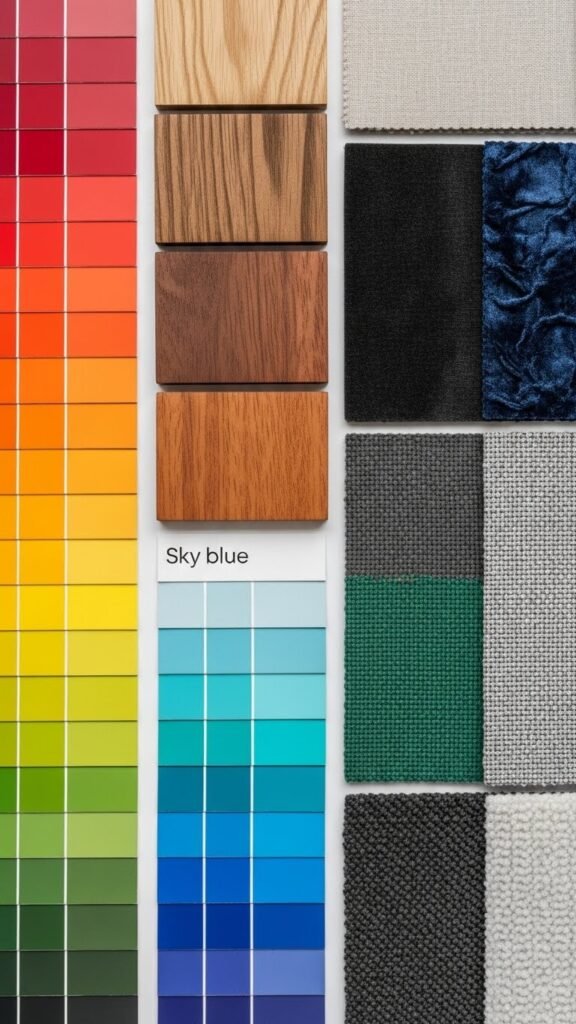
How to tell what you have:
- If your decor leans toward wood, tan, or brass → warm
- If it features black, chrome, or blue hues → cool
Matching undertones keeps the room from feeling “off” even if you love the color.
Choose a Color That Sets the Mood
Paint color isn’t just visual—it’s emotional.
Ask yourself:
- Do I want this room to feel calm or energized?
- Cozy or open?
- Bright or grounded?
Mood-based color ideas:
- Relaxed: soft beige, light greige, muted sage
- Inviting: warm off-white, mushroom gray
- Fresh: pale blue-gray, soft green
- Bold: deep navy, charcoal, rich clay tones
Pick the feeling first. The exact shade comes later.
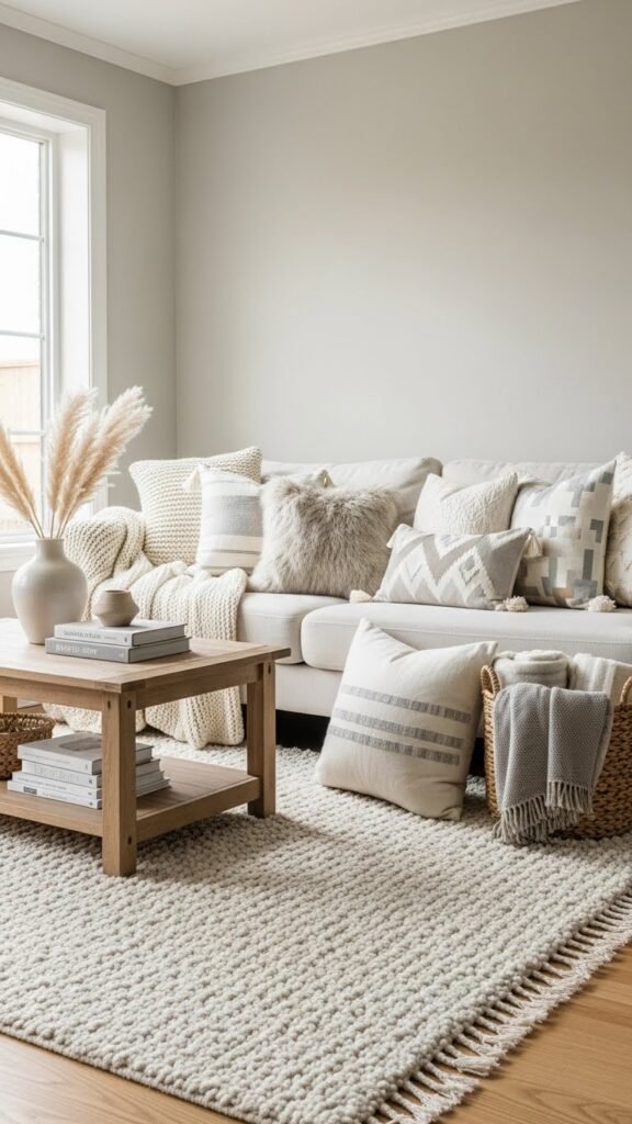
Use the 60–30–10 Rule for Balance
Designers love this rule because it works almost everywhere.
- 60% main color (walls)
- 30% secondary color (furniture, curtains)
- 10% accent color (decor, art)
Your paint color usually falls into the 60% category, meaning it should be calm enough to live with every day.
Example:
- Walls: warm light gray
- Furniture: cream and wood tones
- Accents: black frames, greenery
This keeps the room cohesive without feeling flat.
Test Paint in Real Lighting
Never choose paint under store lighting alone. Light changes everything.
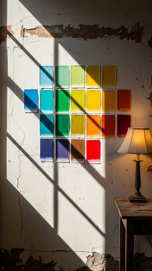
Testing tips:
- Paint large sample squares on multiple walls
- Check them in morning, afternoon, and evening
- Look at them next to your furniture and decor
What looks bright at noon may feel heavy at night.
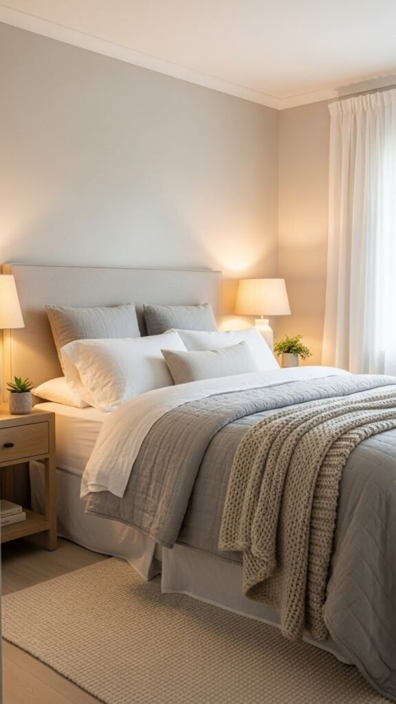
Use Neutrals as a Safe Foundation
If you’re unsure, neutrals are your best friend.
Popular neutral choices:
- Soft white with warmth
- Light greige
- Pale taupe
- Muted gray-beige blends
Neutrals:
- Work with changing decor
- Age better over time
- Make rooms feel larger and brighter
You can always add personality with pillows, artwork, and accents later.
Don’t Forget Flow Between Rooms
Paint colors should make sense together, especially in open spaces.
Easy ways to create flow:
- Use the same neutral in multiple rooms
- Choose shades from the same color family
- Keep undertones consistent throughout your home
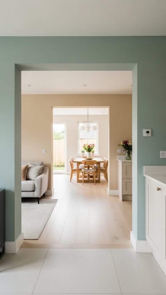
This doesn’t mean everything must match—it just needs to feel intentional.
Trust Your Eye (Not Trends Alone)
Trends can inspire, but your home should reflect you.
Before committing, ask:
- Do I like this color with my stuff?
- Will I enjoy it in every season?
- Does it feel comfortable, not just stylish?
If a color makes you pause or feel unsure, it’s okay to move on.
Final Takeaway
Choosing paint colors that match your decor is about observation, balance, and patience. Start with what you own, respect undertones, test in real light, and focus on how you want the space to feel.
Save this guide for later and use it the next time you’re standing in front of a wall of paint swatches!
Leave a Reply